Guidance for use of color
Customer-facing space
The lobby, reception area, and key customer-facing areas (such as large conference rooms and training rooms) should be designed with neutrals and core colors. Secondary colors should not be featured in these areas.
Internal-facing space
Limit the use of red to small accents and brand-significant items in employee-facing areas. Use neutrals and pull from the secondary color palette for main accent colors in back-of-house spaces.
Finishes and videoconferencing
Below are considerations for the specification of finishes within a camera's field of view.
Things that work well
- Single-color textural patterns
- Tone-on-tone understated patterns
- Neutral wall colors (ex. Light gray, beige, light blue)
Looking for color swatch files?
Find more information about the Red Hat color palette, Pantone values, and swatch files in our brand guidelines. For RAL color matching, please coordinate with with the Red Hat Workplace Strategy and Delivery team.
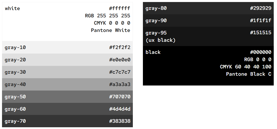
Workplace brand neutrals
Red Hat spaces rely heavily on black, white, grays and natural materials as backgrounds to allow special features to stand out, and for intentional use of our core and secondary colors. Think of these as the foundational building block for the office color palette.

Workplace brand core colors
Our core colors are the colors in the Red Hat logo, and they’re the colors that are most closely associated with our brand.
About Red Hat red
Our primary brand color is red-50, also known as Red Hat red. Every Red Hat workplace includes red-50 to connect back to our brand.
Application of Red Hat red
- Logo signage
- Use Red Hat to define a special architectural feature.
- Use it in a premium finish or material application, such as lacquered paint or back-painted glass.
- When it comes to fabric, light fixtures, or furniture, use our signature shade of red sparingly.
Tints and shades of red
The lighter tints and the darker shades of red are intended to be used as accents only, secondary in hierarchy to Red Hat Red and used sparingly in conjunction with neutrals. This allows Red Hat red to stand out.

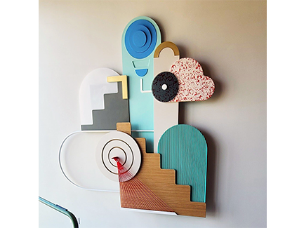
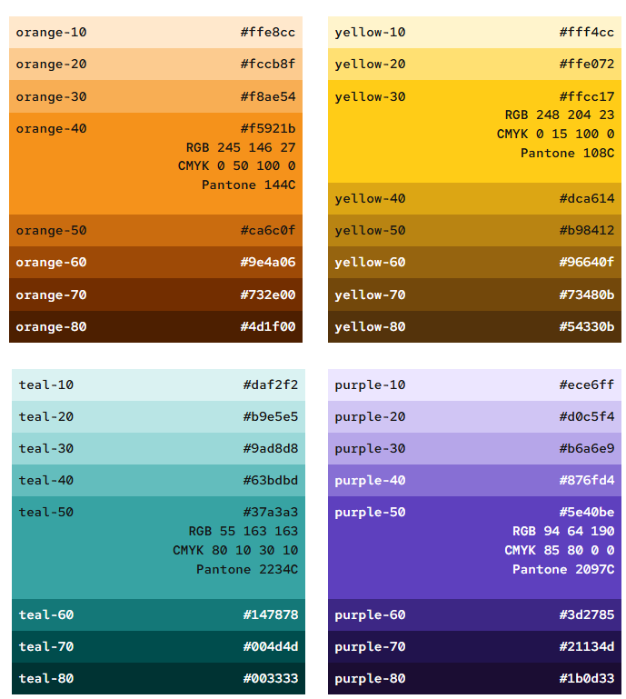
Workplace brand secondary colors
Our secondary colors are versatile, and help our core colors shine.
Color families
Our workplace brand secondary color palette includes 4 color families: teal, purple, orange and yellow.
How to use
Select no more than 2 secondary color families to use with our core colors per area. Use them as tints and gradients for greater depth and variation. Avoid using secondary colors for entire walls.
If you’re not sure where to start when choosing secondary colors, try using one of our color collections. The families used together in these collections complement each other and maintain the spirit of the Red Hat brand when combined.
Application of secondary colors
- Furniture and decor
- Architectural finishes, such as flooring, tile, fabrics
- Environmental graphics
- Wayfinding and neighborhood identity in large offices
Have a suggestion or comment about Work Your Way?
Products
- Red Hat Enterprise Linux
- Red Hat OpenShift
- Red Hat Ansible Automation Platform
- Cloud services
- See all products
Tools
- My account
- Training and certification
- Customer support
- Developer resources
- Learning community
- Partner resources
- Resource library
Try, buy & sell
- Product trial center
- Red Hat Marketplace
- Red Hat Ecosystem Catalog
- Find a partner
- Red Hat Store
- Console
Communicate
About Red Hat
We’re the world’s leading provider of enterprise open source solutions—including Linux, cloud, container, and Kubernetes. We deliver hardened solutions that make it easier for enterprises to work across platforms and environments, from the core datacenter to the network edge.
Subscribe to our newsletter, Red Hat Shares
Red Hat legal and privacy links
- About Red Hat
- Jobs
- Events
- Locations
- Contact Red Hat
- Red Hat Blog
- Diversity, equity, and inclusion
- Cool Stuff Store
- Red Hat Summit